
Oct 12, 2026Packaging Knowledge
Why Do Some Fashion Hang Tags Look Cheap Even with a Good Design?
Why do some fashion hang tags look cheap despite a great design? Learn how paper, thickness, printing, finishing and strings affect the final premium look.
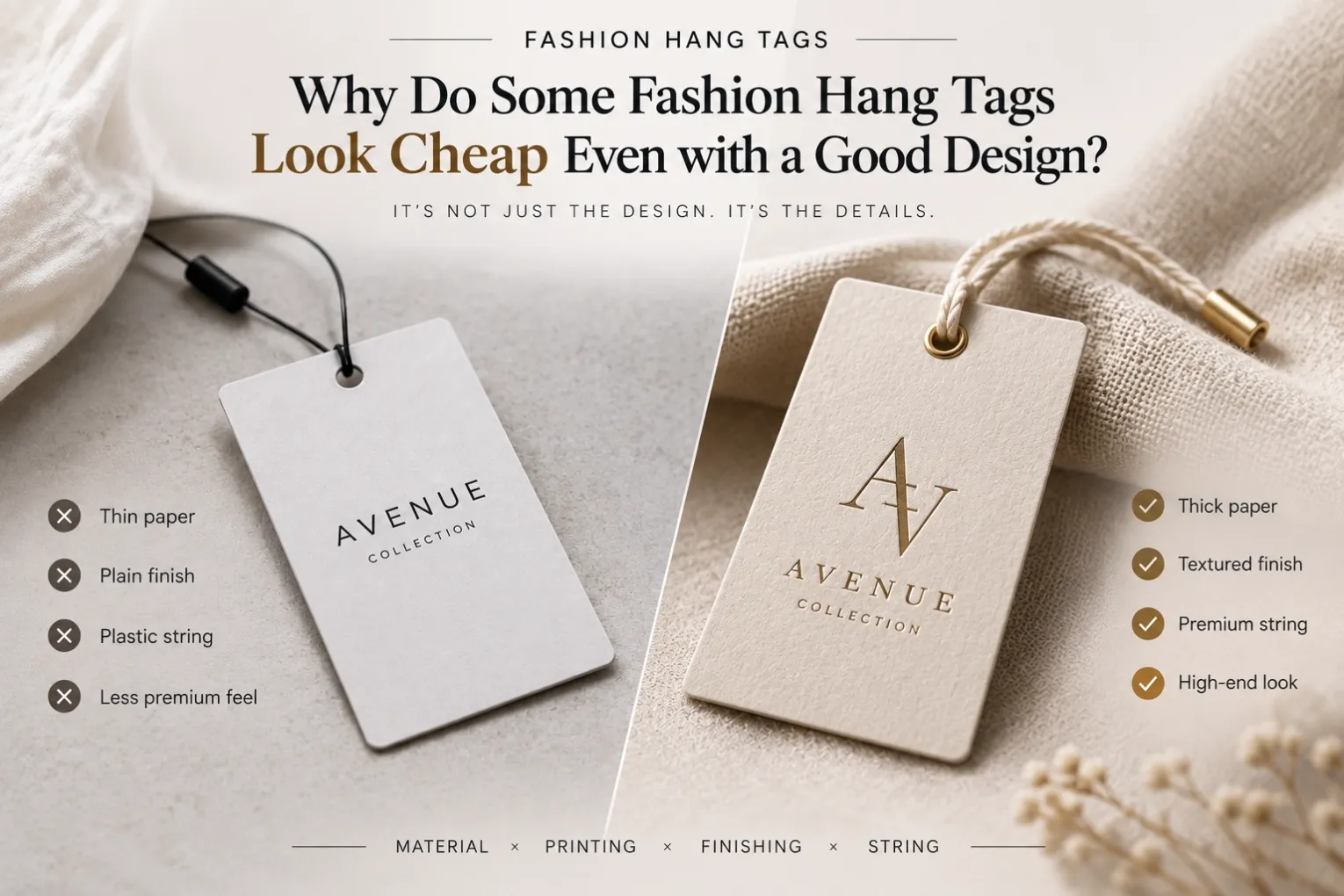
You've spent hours perfecting your logo.
The typography looks clean. The colors feel right. The layout perfectly matches your fashion brand.
On screen, the hang tag looks premium.
Then the physical sample arrives.
Something feels wrong.
The design still looks good—but the hang tag somehow feels cheap. Why?
This is a common frustration when developing fashion hang tags.
The problem isn't always the artwork.
A hang tag is a physical product. Customers don't just see it—they touch it, hold it and experience it together with the garment.
That means paper, thickness, texture, printing, finishing and even the string can completely change how the original design feels in real life.
Here are some of the details fashion buyers and designers should consider.
1. The Paper Is Too Thin for the Design
Paper thickness is one of the fastest ways customers judge the quality of a hang tag.
Imagine a beautiful minimalist black-and-white design printed on very thin cardstock.
The artwork may still look perfect.
But when customers pick up the tag, it bends easily and feels lightweight.
That physical experience can immediately reduce the perceived value of the design.
For premium fashion hang tags, paper thickness should match:
- Tag size
- Garment positioning
- Brand image
- Printing process
- Finishing requirements
But thicker isn't automatically better.
A small delicate jewelry or accessory tag doesn't necessarily need extremely thick cardstock.
The goal is balance.
2. The Paper Texture Doesn't Match the Brand
Paper isn't simply white or brown.
Different papers create completely different impressions.
A smooth coated paper may work beautifully for sharp graphics and vibrant colors.
A textured uncoated paper can create a more natural, understated or handcrafted feeling.
A thick black specialty paper can work well with foil stamping or debossing for a minimalist luxury look.
The important question isn't:
"Which paper is more expensive?"
It's:
"Which paper best supports this design and brand?"
For example, an understated luxury fashion brand may actually look more premium using a carefully selected textured paper with minimal printing than using glossy paper with multiple decorative finishes.
Material should support the design—not compete with it.
3. Too Many Premium Finishes Can Make a Hang Tag Feel Less Premium
This sounds contradictory, but it's something designers should think about carefully.
A supplier may offer:
- Gold foil
- Silver foil
- Embossing
- Debossing
- Spot UV
- Lamination
- Special inks
It's tempting to combine several of them.
But more finishing doesn't automatically create a more luxurious fashion hang tag.
Sometimes the opposite happens.
Imagine:
Gold foil + embossing + Spot UV + glossy lamination + multiple colors
Every individual process may be considered "premium," but together they can make the design feel busy.
For many fashion brands, a stronger approach might be:
Thick paper + one-color printing + deep debossed logo
or:
Textured paper + subtle foil stamping
Luxury often comes from restraint.
Premium doesn't mean adding more. It means choosing the right details.
4. The Wrong Foil Color Can Change the Entire Brand Feeling
Gold foil is popular in fashion packaging.
But "gold" isn't one single color.
There are many different foil tones and effects:
- Bright gold
- Champagne gold
- Matte gold
- Rose gold
- Antique gold
- Metallic silver
- Matte silver
A bright yellow gold may look perfect for one brand but completely wrong for another.
For a minimalist fashion label, champagne gold or matte metallic foil may create a much more refined result.
The same applies to silver, copper and other metallic finishes.
Don't choose foil simply because it looks luxurious.
Choose it because it works with your brand colors, paper and overall design language.
5. The String Can Make an Expensive Tag Look Cheap
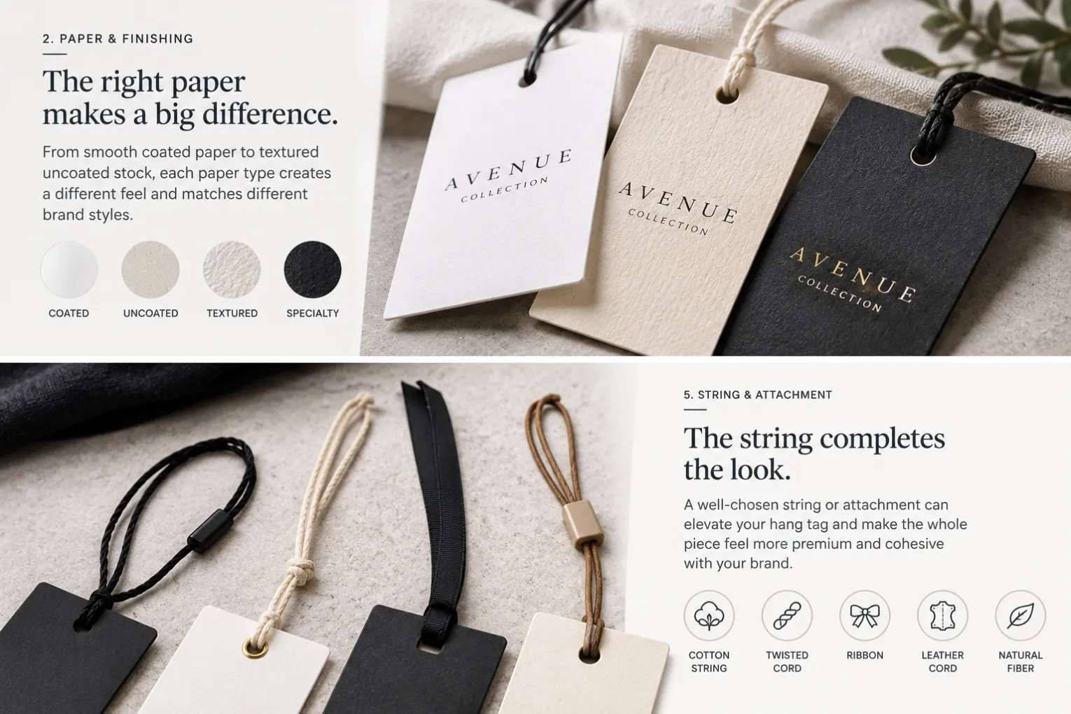
This is one of the most overlooked details in fashion hang tag design.
Buyers often spend most of their time choosing:
- Paper
- Logo
- Printing
- Foil
- Embossing
Then the string becomes an afterthought.
But imagine a beautiful thick cardstock hang tag with an elegant debossed logo—and then attach it using a thin, shiny plastic string that doesn't match the design.
The perceived quality changes immediately.
Depending on the brand, you might consider:
- Cotton string
- Waxed cord
- Twisted cord
- Ribbon
- Elastic string
- Natural fiber string
The color matters too.
Black isn't always the answer.
Cream, beige, grey, brown or a custom brand color may integrate much better with the garment and tag.
A fashion hang tag should be considered as one complete object: tag + hole + string + attachment.
6. The Tag Size and Paper Thickness Don't Work Together
Size and thickness should be considered together.
A large hang tag made from paper that is too thin may bend or curl easily.
That can make an otherwise premium design feel inexpensive.
On the other hand, a very small tag made from extremely thick board can feel bulky and awkward.
When developing custom fashion hang tags, ask:
- How large is the tag?
- How heavy is the garment?
- Will there be one tag or several?
- Where will the tag hang?
- How should it feel when the customer touches it?
The physical proportions matter just as much as the graphic proportions.
7. Screen Colors Don't Always Create the Same Feeling on Paper
Designers usually develop artwork on a screen.
But customers experience the final design on paper.
A warm beige on a monitor may become darker or duller when printed on uncoated stock.
A sophisticated grey may shift depending on the paper color.
A deep black may look completely different on coated white paper versus textured black cardstock.
This doesn't necessarily mean the design is wrong.
It means paper and printing are part of the design.
For fashion brands with strict color requirements, physical material and printing samples can be extremely valuable before making the final decision.
8. The Hang Tag Doesn't Match the Garment
This may be the most important point of all.
A hang tag shouldn't be judged only by placing it on a desk.
It should be judged next to the actual product.
Ask yourself:
Does this tag feel like it belongs to this garment?
A lightweight natural-linen collection might feel strange with a heavy glossy black tag.
A premium tailored jacket may feel under-branded with a thin generic paper tag.
A sustainable fashion collection may benefit from natural paper, minimal printing and simple finishing.
The best fashion hang tags don't compete with the garment.
They complete the presentation.
Good Design Is Only Half the Job
A beautiful Illustrator or PDF file is only the beginning.
The final result depends on how that design translates into:
Paper + Thickness + Texture + Printing + Finishing + String + Garment
If one element feels wrong, the entire hang tag can lose its premium appearance.
That's why experienced fashion buyers and designers shouldn't ask only:
"Does the artwork look good?"
They should also ask:
"Will this design still feel right when it becomes a physical product?"
A Simple Example
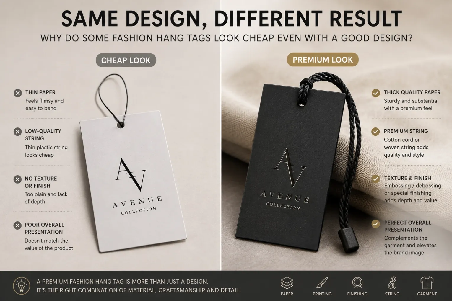
Imagine the same minimalist fashion logo produced in three different ways.
Option A
Thin coated paper + glossy lamination + standard plastic string
Option B
Thick uncoated textured paper + one-color printing + cotton string
Option C
Thick specialty paper + deep debossed logo + matching premium cord
The logo hasn't changed.
The artwork hasn't changed.
But the customer's perception of the brand can be completely different.
That's the power of material and finishing choices.
Final Thoughts
If your fashion hang tag looks great on screen but feels disappointing when the physical sample arrives, don't immediately redesign the artwork.
Look at the complete product.
Check:
- Paper thickness
- Paper texture
- Tag size
- Printing
- Foil color
- Finishing
- String
- How the tag looks with the garment
Sometimes a small material change can improve the result more than redesigning the entire tag.
The best fashion hang tags aren't necessarily the most complicated or expensive.
They're the ones where design, material and finishing work together naturally.
Developing Fashion Hang Tags for Your Brand?
If you already have a design but aren't sure which paper, thickness, finishing or string will achieve the right look, we can help you evaluate the options before production.
From minimalist debossed tags to foil-stamped and textured custom fashion hang tags, the goal is to find a combination that fits your brand—not simply add more finishing.
👉 Explore Our Fashion Hang Tags
👉 Request a Custom Hang Tag Quote
Related Articles
- Before You Approve Your Hang Tag Artwork, Check These 8 Things
- Why Does the Bulk Hang Tag Look Different from the Approved Sample?
- How to Choose the Right String for Fashion Hang Tags
- What Should Fashion Designers Put on a Hang Tag?