
Sep 23, 2026Blog
Why Do Printed Colors Look Different on Brown Kraft Paper?
Printing on brown kraft paper changes how brand colors appear. Learn how kraft substrate, white underbase, Pantone and CMYK affect printed results.
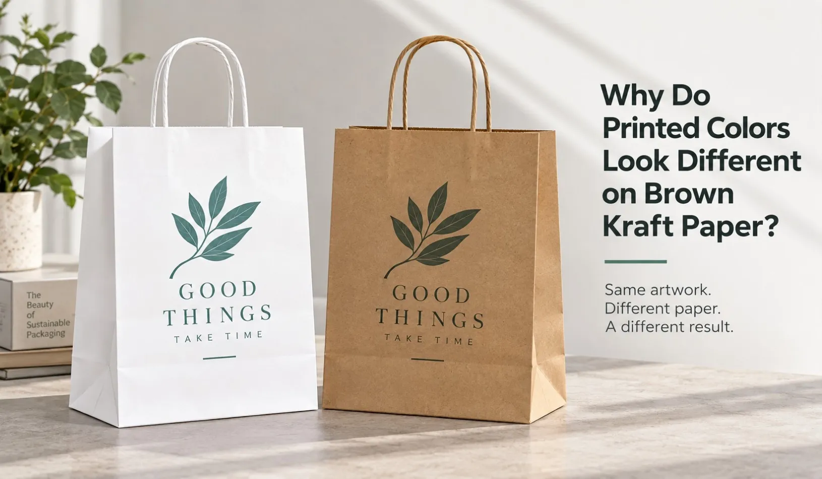
Brown kraft paper is popular for paper shopping bags because of its natural appearance and distinctive texture.
But buyers sometimes notice something unexpected after printing:
The printed color does not look exactly the same as it did on the artwork file or on white paper.
A bright red may appear darker or warmer. A light color may lose some of its brightness. Some brand colors may look more muted than expected.
This does not necessarily mean that the artwork or printing is wrong.
The reason is simple:
The color and surface of the paper become part of the final printed result.
Understanding how the substrate affects printing can help buyers choose the right paper, printing method and color approval process before mass production.
Why Does Brown Kraft Paper Change Printed Colors?
Printing ink is applied onto a physical material, and that material already has its own color and surface characteristics.
White paper provides a relatively neutral background for many printed colors.
Natural brown kraft paper does not.
Its brown base color can influence how the printed ink is visually perceived, especially when the ink does not completely block the substrate underneath.
Think of the final appearance as a combination of:
Paper Color + Ink + Printing Process = Final Visual Result
This is why the same artwork may look different when printed on:
- White kraft paper
- Natural brown kraft paper
- Recycled kraft paper
- Coated paper
- Textured specialty paper
Choosing the paper is therefore also part of choosing the final appearance of the packaging.
Brown Kraft Paper vs White Paper: Why Does the Same Artwork Look Different?
Imagine printing the same red logo on two paper bags.
Bag A: White paper
Bag B: Natural brown kraft paper
Even if both use the same artwork and color reference, the finished appearance may not be identical.
On white paper, the red may appear brighter and cleaner.
On brown kraft paper, it may appear:
- Darker
- Warmer
- Less vivid
- More natural or earthy
The difference can become more noticeable with lighter or brighter colors.
This is especially important when a brand changes from white paper bags to brown kraft bags but wants to keep the same artwork.
The artwork may remain unchanged, but the substrate has changed.
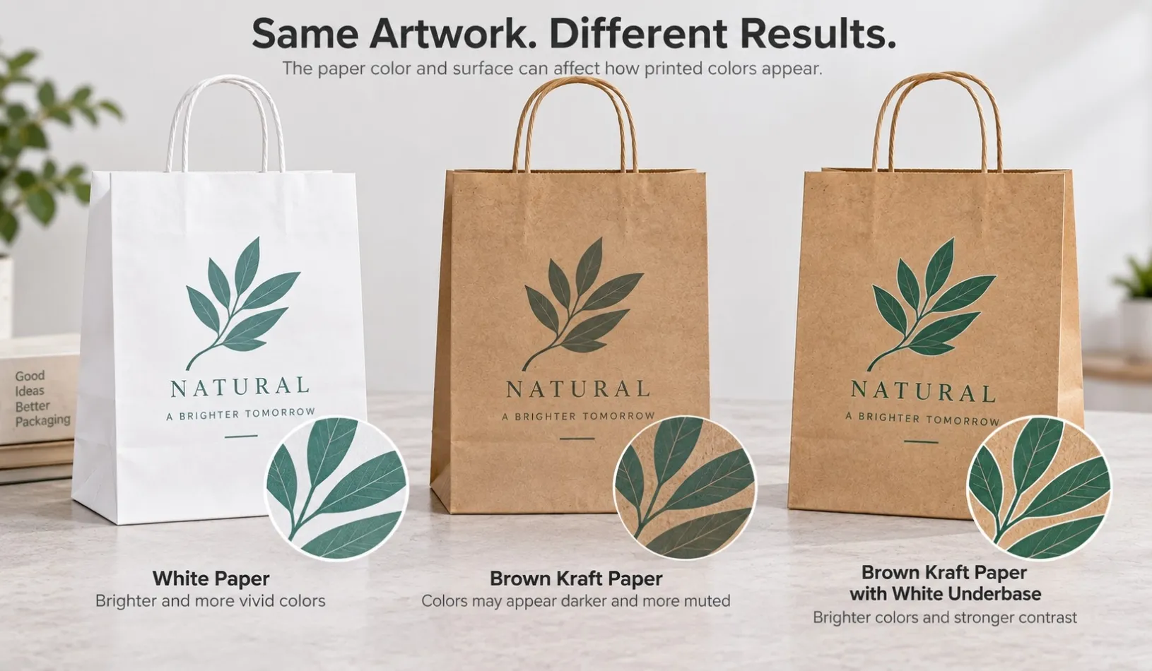
Why Do Light Colors Lose Brightness on Brown Kraft Paper?
Light colors generally have less contrast against a natural brown background.
For example:
- Pale yellow
- Light pink
- Light blue
- Pastel green
- Light grey
may not appear as bright on brown kraft paper as they do on a white background.
The exact result depends on several factors:
- Kraft paper color
- Paper surface
- Ink
- Printing method
- Ink coverage
- Artwork design
The surface characteristics of the selected kraft paper can also influence how the ink appears.
This does not mean light colors cannot be printed on kraft paper.
It means they should be evaluated on the actual paper material, rather than judged only from artwork displayed on a screen.
Can You Print White on Brown Kraft Paper?
Yes. White can be printed on brown kraft paper when a suitable printing process is used.
White printing can create strong contrast against the natural brown background and is often used for:
- Logos
- Text
- Simple graphics
- Minimalist packaging designs
However, the finished white may depend on the paper surface, printing process, ink coverage and required opacity.
A white area shown in a PDF should therefore not automatically be assumed to represent the exact appearance of the finished white print.
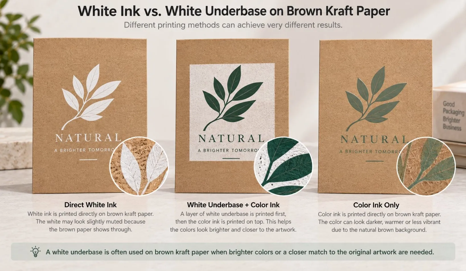
Direct White Ink vs White Underbase
Direct white printing and a white underbase serve different purposes.
Direct white printing:
Brown Kraft Paper → White Ink
Here, white itself is part of the visible design, such as a white logo printed on a kraft paper bag.
A white underbase works differently:
Brown Kraft Paper → White Base → Color Ink
The white layer is placed underneath another color to reduce the influence of the brown substrate.
This can be useful when the design requires brighter colors or when a particular brand color is significantly affected by the natural kraft background.
Whether a white underbase is practical or necessary depends on the artwork, printing process, quantity and required appearance.
Can a White Underbase Make Colors Look Brighter?
In suitable printing applications, a white underbase can help some colors appear brighter and less influenced by the brown paper underneath.
It may be considered when:
- A bright brand color is important
- The artwork contains lighter colors
- Greater contrast is required
- The brown substrate changes the desired appearance too much
However:
A white underbase does not automatically make printing on brown kraft paper look identical to printing on white paper.
The final appearance still depends on the paper, ink, printing process, white base and color printed above it.
For color-sensitive projects, the actual result should be evaluated before mass production rather than relying only on the artwork file.
CMYK vs Pantone: Which Is Better on Brown Kraft Paper?
There is no single answer for every design.
The choice depends on the artwork and the required result.
CMYK
CMYK is commonly used for artwork containing:
- Multiple colors
- Images
- Gradients
- Detailed graphics
It provides flexibility for more complex artwork.
However, the final appearance is still affected by the selected paper.
Pantone or Spot Colors
Spot colors can be useful when an important brand color needs a defined reference for communication between the buyer, designer and printer.
But there is an important limitation:
A Pantone reference does not guarantee that the color will look identical on every substrate.
A Pantone reference viewed on white stock and the corresponding ink printed on natural brown kraft paper may still appear different.
Pantone provides a useful color reference.
The paper still contributes to the final visual result.
Do Dark Colors Work Better on Brown Kraft Paper?
Dark colors often create stronger visual contrast against natural brown kraft paper.
Common choices include:
- Black
- Dark brown
- Dark green
- Navy
- Deep red
Simple one-color artwork can work particularly well with the natural character of kraft paper.
This is one reason many brands choose relatively simple printing when using brown kraft bags.
But dark printing is not a rule.
Light or bright colors may also work depending on the intended design, printing process and use of white ink or an underbase.
The better question is not:
Which color is always best for kraft paper?
It is:
Which printing solution gives the intended appearance on this particular paper?
What Happens to Brand Colors on Brown Kraft Paper?
Brand colors often need additional attention because the same color may be used across:
- Packaging boxes
- Paper bags
- Labels
- Hang tags
- Printed materials
- Retail displays
The same brand color can appear different when the substrate changes.
For example:
Brand Color + White Paper
may produce a different visual result from:
Same Brand Color + Natural Brown Kraft Paper
This is why providing only a Pantone number may not answer every production question.
The supplier also needs to know what material the color will be printed on.
Does Surface Finishing Change the Final Color?
It can.
The final appearance of printed packaging is affected not only by ink and paper but also by what happens after printing.
Depending on the material and process, finishing may influence:
- Surface gloss
- Contrast
- Perceived color depth
- Texture
- Overall visual appearance
For example, a glossy surface and an uncoated natural kraft surface can give the same design very different visual characteristics.
Paper, printing and finishing should therefore be evaluated together rather than treated as completely separate decisions.
Should Buyers Approve Color From a Screen?
A screen is useful for reviewing:
- Artwork layout
- Logo position
- Text
- General color direction
But it should not always be treated as an exact reference for final physical color.
Screens display color using light.
Printed packaging uses ink on a physical substrate. This is one reason packaging colors can look different from the approved artwork.
Screen settings can also vary between devices.
Printed packaging uses ink on a physical substrate.
Screen settings can also vary between devices.
This becomes particularly important when the printing substrate itself has a strong color, as natural brown kraft paper does.
For projects where color is important, buyers should discuss an appropriate physical color reference, proof or sample with the supplier before mass production.
For other specifications that should be checked before production—including GSM, handles, reinforcement and finishing—see our custom paper bag buying guide.
A Common Buyer Situation
A buyer has an existing brand color and sends a PDF artwork for a new kraft paper shopping bag.
The artwork looks bright and clean on screen.
The buyer then selects natural brown kraft paper but expects the printed brand color to look exactly like the PDF.
After seeing the physical result, the color appears darker than expected.
The artwork itself may not be the problem.
The substrate has changed.
Instead of immediately changing the artwork or ink, the buyer and supplier should first confirm:
- Which kraft paper is being used?
- Is the natural brown background part of the intended design?
- How important is exact brand-color appearance?
- Which printing method will be used?
- Should white ink or a white underbase be considered?
- How will the physical color be approved?
Answering these questions before mass production gives both sides a much clearer production reference.
When Is White Kraft Paper a Better Choice?
Brown kraft paper is not automatically the best choice simply because a brand wants a natural-style paper bag.
White kraft paper may be worth considering when:
- Bright printed colors are important
- The artwork contains several light colors
- A cleaner background is preferred
- Brand-color appearance is a high priority
Brown kraft paper may be more suitable when:
- The natural kraft appearance is part of the design
- Simple printing is preferred
- Dark artwork provides sufficient contrast
- Interaction between the paper color and printed color is acceptable or desirable
The material decision should therefore consider both appearance and production requirements.
What Should Buyers Confirm Before Printing Kraft Paper Bags?
Before approving custom printed kraft paper bags, review the complete specification rather than the artwork alone.
1. Paper Type
Is the bag made from natural brown kraft, white kraft or another paper?
2. Actual Paper Color
Natural kraft is not a perfectly neutral background.
Confirm the selected paper rather than judging color against a generic brown background on a screen.
3. Critical Brand Colors
Identify which colors are important to the brand and which colors allow more visual variation.
4. Printing Method
The suitable printing method depends on the artwork, paper, quantity and required result.
5. White Ink or White Underbase
If the artwork contains white, light or bright colors, confirm whether white printing or an underbase should be considered.
6. Surface Finishing
Consider how the selected finishing may affect the overall visual appearance.
7. Physical Color Approval
If color is critical, confirm how the physical result will be evaluated before mass production.
A useful approval question is:
Are we approving the artwork color, or are we approving how that color actually looks on the selected kraft paper?
The second question is usually more relevant to the finished packaging.
FAQ
Can you print full color on brown kraft paper?
Yes, depending on the paper, artwork, printing process and required result. However, the natural brown substrate may influence how some colors appear, so the finished result should not automatically be expected to match the same artwork printed on white paper.
Can you print white on brown kraft paper?
Yes, with a suitable printing process. White can be used as a visible design color, such as a white logo, or in some applications as an underbase beneath another color.
Do Pantone colors look the same on brown kraft paper?
Not necessarily. A Pantone reference is useful for color communication, but the substrate can influence the final visual appearance. The same color may look different on white paper and natural brown kraft paper.
Is CMYK suitable for kraft paper bags?
It can be, particularly for multi-color artwork, images and more complex designs. The suitability depends on the paper, artwork, printing method and expected appearance.
Should I approve kraft paper bag colors from a PDF?
A PDF is useful for checking artwork and general color direction, but it may not accurately represent the final physical color on brown kraft paper. For color-sensitive projects, discuss an appropriate physical reference or sample before mass production.
Is white kraft paper better for bright colors?
It may be a better option when bright or light colors and a cleaner background are important. The choice between white and brown kraft should depend on the desired appearance and production requirements.
Final Thoughts
Printing on brown kraft paper is different from printing the same artwork on a white background.
The natural color and surface of the kraft paper become part of the final visual result.
That is why a color may appear darker, warmer or less vivid even when the artwork itself has not changed.
For buyers, the key is not simply to ask:
“Can you print this CMYK or Pantone color?”
A more useful question is:
“What will this color look like on the actual kraft paper we are using?”
By confirming the paper, artwork, printing method and color expectations together, buyers can reduce unexpected differences before mass production.
If you are developing custom printed kraft paper bags, Jeeli Packaging can review your artwork, paper material, printing colors and finishing requirements before sampling and production.