
Sep 24, 2026Blog
Why Do Packaging Colors Look Different From the Approved Artwork?
Why do packaging colors look different from approved artwork? Learn how CMYK, Pantone, paper and finishing affect color—and what buyers can check before production.
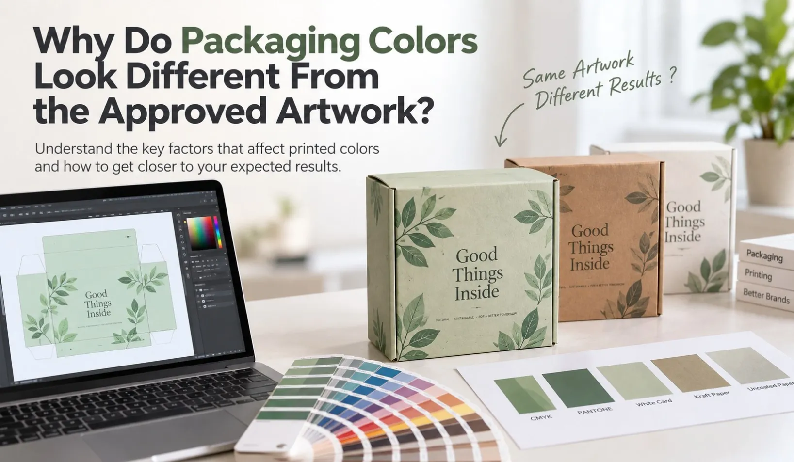
You approve the artwork on your computer, but when the printed packaging arrives, the color looks different.
The blue may appear darker. The beige may look warmer. A bright color on screen may look less vivid on paper. Even packaging printed from the same artwork can look different when different paper materials or surface finishes are used.
This does not always mean the artwork or printing is wrong.
The final appearance of a printed packaging color can be influenced by several factors:
Artwork → Color System → Paper Material → Printing → Surface Finishing → Sample → Bulk Production
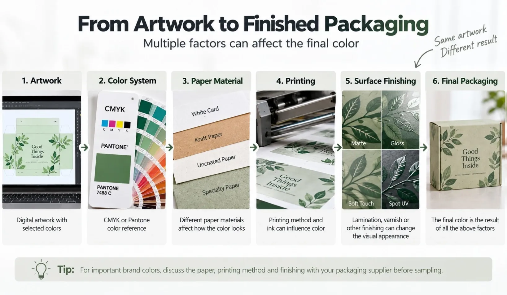
Understanding these factors before production can help buyers set more realistic color expectations and make better decisions during sampling and approval.
Why Do Screen Colors Look Different From Printed Packaging?
One of the most common reasons for a packaging color difference starts before printing even begins.
Computer screens, phones and tablets display colors using light. Printed packaging creates colors using ink on a physical material.
Because these are different color environments, a color displayed on a screen may not reproduce exactly the same way on paper.
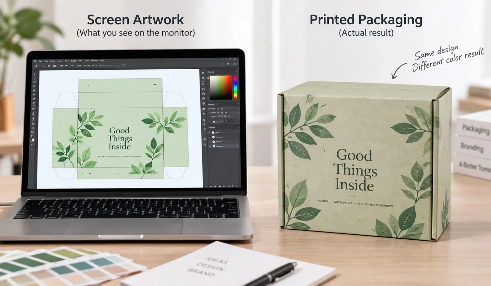
Screen brightness also matters.
A bright monitor can make artwork appear:
- more vivid
- brighter
- more saturated
- higher in contrast
The printed result may therefore appear slightly darker or less luminous.
This is why approving a packaging color only by looking at a screen can sometimes be misleading.
How Do CMYK and Pantone Affect Packaging Colors?
The printing method and color system are also important.
CMYK Printing
CMYK uses combinations of:
- Cyan
- Magenta
- Yellow
- Black
to reproduce a wide range of colors.
It is commonly used for packaging with photographs, gradients, illustrations and multi-color artwork.
However, some brand colors can be difficult to reproduce consistently through CMYK alone.
A specific green, orange, blue or other brand color may look slightly different depending on the CMYK combination, paper and printing conditions.
Pantone or Spot Color Printing
For packaging where a particular brand color is important, a Pantone or other specified spot color may be considered.
Instead of building the color from four CMYK inks, the color is printed using a specified ink formulation.
This can provide a clearer physical reference for color communication.
However, using a Pantone reference does not mean the final appearance will look identical on every material.
The paper underneath the ink still matters.
Can Paper Material Change the Printed Color?
Yes.
The same ink can look different when printed on different paper materials.
For example, consider the same artwork printed on:
- white card
- coated paper
- uncoated paper
- kraft paper
- recycled paper
- specialty paper
A bright white surface usually reflects color differently from brown kraft paper.
An uncoated paper may absorb ink differently from a smoother coated surface.
Specialty papers may also have their own texture, shade or surface characteristics.
The base color and surface of the paper also matter. A bright white board, a warm off-white paper and a natural brown kraft paper provide different backgrounds for the same printed ink.
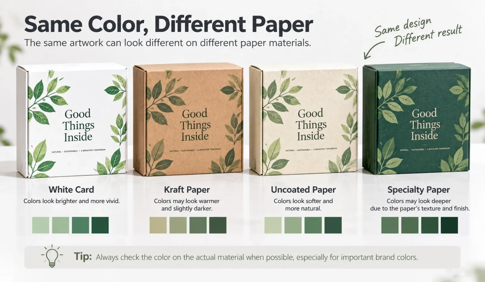
This is why paper selection should be confirmed together with color expectations rather than treated as a separate decision.
The better question is:
How will this color look on the actual paper selected for the packaging?
This is especially important when changing materials after artwork or color approval.
Why Do Colors Look Different on Kraft Paper?
Kraft paper is a good example of how the substrate can influence printed color.
Because natural kraft paper has a brown base color, the paper itself can affect the appearance of ink printed on top of it.
Light colors may appear less bright, while some colors may become warmer or darker than they appear on white paper.
For certain designs, this natural effect is intentional and contributes to the kraft appearance.
For other designs, especially where accurate reproduction of a light or bright brand color is important, the printing approach may need additional consideration.
This is why artwork that looks good on a white digital background should not automatically be expected to look identical on natural kraft paper.
Can Lamination and Finishing Change How a Color Looks?
Printing is not always the final step.
Surface finishing can also change how buyers perceive a color.
Depending on the packaging design, finishing may include:
- gloss lamination
- matte lamination
- soft-touch finishing
- aqueous coating
- varnish
- spot UV
- foil stamping
A gloss surface may make colors appear more reflective or visually stronger.
A matte surface may reduce reflection and create a softer appearance.
Soft-touch or other specialty finishes can also change how the printed surface looks under different lighting.
So when color is important, buyers should consider:
Printed Color + Paper + Surface Finish
rather than evaluating the printed ink alone.
Why Can a Sample Look Different From Bulk Production?
Another common question is:
“The sample was approved. Why does the bulk production look slightly different?”
An approved sample is an important reference, but buyers should first understand how the sample was produced.
Some samples may be digitally printed or made using a different production process from the final bulk order.
For example, a digitally printed sample can be useful for checking the box structure, artwork position and overall design, but it may not always be the best reference for judging the exact color of an offset-printed bulk order.
Bulk production may use offset printing or another production method.
Differences may therefore come from:
- printing method
- ink system
- paper batch
- surface finishing
- production conditions
- the way the sample itself was made
Even when the same general specifications are followed, a physical sample and bulk production should not automatically be assumed to be visually identical under every condition.
For color-sensitive packaging, the sampling method and color reference should therefore be confirmed before approval.
Can the Same Color Look Different Under Different Lighting?
Yes.
A printed package may appear slightly different under:
- daylight
- office lighting
- warm indoor lighting
- retail lighting
- photography lighting
This is another reason why two people can look at the same printed package and describe the color differently.
For important color approvals, it is better to compare samples under reasonably consistent lighting conditions rather than comparing one sample beside a bright computer monitor and another under warm indoor light.
If color matching is especially important, agree with the supplier on how the physical color reference will be evaluated before production.
Why Can Two Packaging Materials Make the Same Brand Color Look Different?
A brand may use the same logo color across several packaging products, for example:
- a folding carton
- a corrugated mailer box
- a paper shopping bag
- a hang tag
But these products may use completely different materials. For example, printed folding cartons are often produced on a different substrate from kraft mailer boxes or paper bags.
The same color specification printed on smooth white card may not visually match the same color printed on kraft paper or corrugated board. This is especially relevant for printed mailer boxes, where the corrugated material and printing surface can influence the final appearance.
This becomes especially important when several packaging components are used together.
For example:
If the buyer expects all four items to look visually similar, the materials and printing methods should be considered together rather than approving each item independently based only on the digital artwork.
Should Buyers Use CMYK or Pantone for Brand Colors?
There is no single answer for every packaging project.
CMYK may be suitable when:
- the design contains many colors
- photographs or gradients are used
- exact matching of one particular brand color is not the main priority
A specified spot color may be worth considering when:
- one or more brand colors are especially important
- the design is relatively simple
- a physical color reference is needed for production communication
But the choice should also consider:
- material
- printing quantity
- printing method
- finishing
- budget
- required visual result
The goal is not simply to choose the “best” color system.
The goal is to choose a production method appropriate for the packaging and the level of color control required.
What Should Buyers Confirm Before Approving Packaging Colors?
Before approving artwork or a sample, it helps to check more than the color displayed on a computer.
1. Confirm the Actual Packaging Material
Know whether the design will be printed on white card, kraft paper, coated paper, specialty paper or another material.
2. Confirm the Color Requirement
Determine whether the color is a general visual preference or an important brand color that needs a defined physical reference.
3. Confirm CMYK or Spot Color
Do not assume the supplier will interpret a screen color exactly as you expect.
If a particular color is critical, discuss how it should be specified.
4. Confirm the Surface Finishing
Matte, gloss and other finishes can change the final visual appearance.
5. Understand How the Sample Is Produced
Ask whether the sample uses the same printing and finishing process planned for bulk production.
6. Review a Physical Sample When Color Is Critical
For color-sensitive projects, a physical reference is usually more useful than relying only on a digital artwork preview.
7. Keep the Approved Reference
Once the color and packaging appearance are approved, keep the approved physical reference available for comparison where practical.
What Information Should You Send Your Packaging Supplier?
If color is important to your packaging project, provide as much relevant information as possible before sampling.
Useful information can include:
- artwork file
- brand color reference
- CMYK or Pantone information, if available
- packaging material
- surface finishing
- product type
- quantity
- an existing physical sample, when relevant
This gives the supplier a better starting point for discussing how the artwork may translate into actual printed packaging.
Final Thoughts
When packaging colors look different from approved artwork, the reason is not always one single printing problem.
The final result is influenced by the complete production combination:
Artwork → Color System → Paper Material → Printing → Surface Finishing → Sample → Bulk Production
For buyers, the most important step is to define which colors are critical and confirm how those colors will be evaluated before mass production.
A color that looks correct on a screen is only the beginning. The actual packaging material, printing process and finishing ultimately determine how that color appears on the finished product.
If you are developing custom printed packaging, send us your artwork, packaging type, paper material, surface finishing, quantity and Pantone or CMYK color information if available. These details provide a better starting point for reviewing the printing approach before sampling.